Hey blog, we are almost beginning our production!!! Pre-production is all done, with the discussion of costumes and props with Isabel (as well as the cast) happening. To begin thinking about editing and stylistic choices, we began to think about something very important/ reflective of our opening tone: title font.
Exploring References
Before definitively choosing one (which we still haven't as we are in that process), I decided to look at some actually chosen title fonts and how they add/ develop the story's tone.
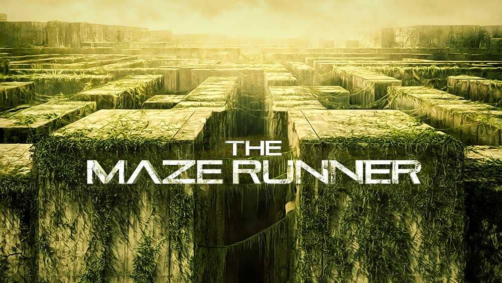
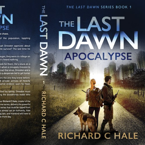
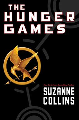
I began to look at dystopian movies/book title fonts, even if I'm not familiar with them so I could get an idea of common title fonts used in dystopias. Here are some I found:
Although I've never read this book series, I wanted to include it to depict the similarities between different dystopian books/ movies.


While each of these titles is different and specific to its own series, the strict structure and boxy shape of the Maze Runner and Hunger Games reflect the governmental control/ the enclosed atmosphere of the "games" in both series. Divergent is less boxy and "strict", possibly because the actual title stands for a unique group in the controlled society. Investigating how something as "seemingly small" as the title font is reflective of the story/ tone that is trying to be imposed on the consumer was really helpful to make sure we are making the right choice with our own title display.
Current Options
After getting an idea of how important the font is not only for the title but also for the credits and additional writing, Isabel and I began to check out options. We looked into the video editing app Capcut's fonts, as we've used it before to edit projects, such as our One Word Film project. They have a pretty diverse palette of fonts and like many editing software, have the typing display option which we definitely want to integrate whether that's for the main title slide or the contextual slide that has the words "five months earlier". We want to lead into the title with a type-in effect because the opening scene has to do with files, as well as the leading scene in an office. The feeling that the typing gives off, almost as if leading the viewer to a final destination (with the viewer not knowing where it ends) feels intriguing and true to the opening. It also adds a dynamic to the quicker jump cuts/ pace of the editing giving the viewer a chance to focus in on the important title slide that reveals a lot about the movie. (they would find that out after watching the actual movie! Who knows maybe we will continue this story one day!)

Our first option is this more rustic, detectivey font. It reminds me of files and gives me the impression that the movie will be about investigation/mystery. While that's true, I also want to truly emphasize the strict order of the society, and almost give a vague yet powerful impression, to initially illustrate the type of censored/ nonexplicit approach to the whole movie. This is a font that feels less stereotypical/ expected for a dystopian film which we are considering using.

This font reminds me more of the examples I showed above of the dystopian books/ films. It steers less away from the traditional genre expectations but doesn't feel necessarily too repetitive/ recognizable from some of the examples. We would use plain white lettering and also probably the typing effect. This feels like a reliable option, as it's not too intense and allows the audience to truly focus on the title with no distractions. The contrast of black background and bright white lettering really enforces the title's importance to the whole idea of the film, and how connecting the protagonist is to the title (Doran appears in the last shot before this, with other additional shots from our opening alluding to the fact that HE IS the "lost file").
Overall Conclusions
Although these are only two options, Isabel found them and I honestly think that they are very good ones. They don't feel too cheesy/ forced with our story, but we do need to figure out what we want to prioritize: an immediate visual representation of a more controlled/ less "creative" font to reintroduce the governmental order/ lessening of individuality as indicated by the very first opening scene, or a more "investigative" font that feeds the viewers questions and alludes to possible answers. We will keep discussing this week.


No comments:
Post a Comment